BeeSmart

Website preview & recommendation
Prepared for BeeSmart Ltd

Private preview for BeeSmart Ltd

A new website for BeeSmart, ready to review

This page is a guided walkthrough of the work. It opens with the design we recommend, shows three other directions we explored, sets out what every option already includes, and lists exactly what we need from you to take it live.

4 complete demo sites 11 pages each, built to compare Both licensed centres covered

Why now

The case for doing this

BeeSmart has the audience, the reputation and a live intake. What it does not yet have is a website working for it. That gap is the whole opportunity.

18 mo

beesmart.com.mt has shown a single “Coming Soon” placeholder since February 2025. Every parent who searches Google instead of Facebook currently finds nothing.

5.2K

Facebook followers, and 100% recommended across 14 reviews. The trust already exists — it just lives on one platform.

Oct 2026

An intake is being filled right now, with open days parents ask to book in the Facebook comments. A real site turns that interest into enquiries.
★ Our recommendation
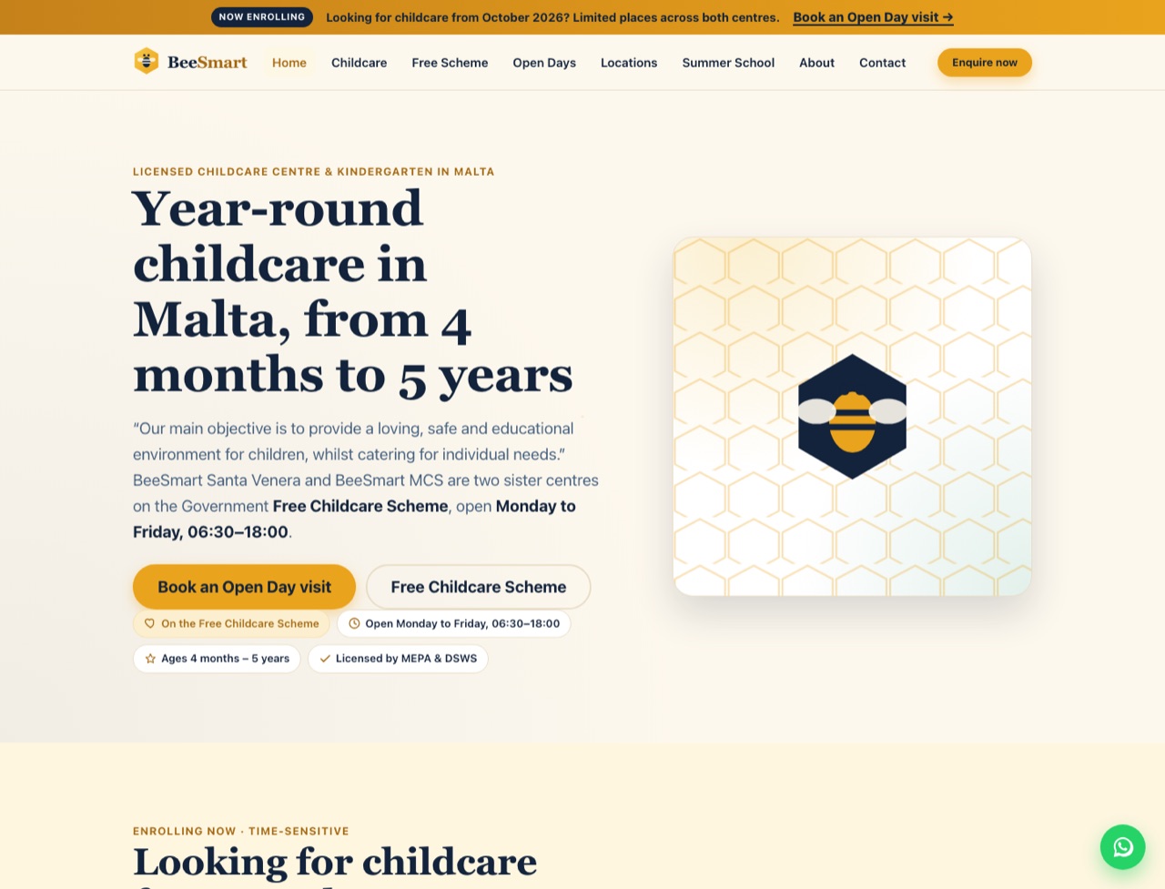
Screenshot of the recommended BeeSmart website design (beta4): a cream homepage with the heading 'Year-round childcare in Malta, from 4 months to 5 years', honey-gold buttons, a deep-navy hexagon bee logo and an October 2026 enrolment banner. Recommended design · beta4

The bee & honeycomb identity

Design 4 — the one we’d build

It is the most capable and the most thorough of the four: a confident bee-and-honeycomb identity built mobile-first and accessible, with the strongest groundwork for being found on Google.

  • Built to be foundThe richest search-engine groundwork of the four — 39 blocks of structured data describing both centres, their services and programmes.
  • Tools parents actually useA working Summer Club fee calculator and an age-based programme finder that guide a parent straight to the right answer.
  • Clear at a glanceA tabbed weekly timetable and an events calendar make the daily routine and open days easy to read.
  • Right on every screenMobile-first and accessible from the ground up — most of your Facebook audience will arrive on a phone.
Open the recommended site Opens in a new tab

For comparison

Other directions we explored

Three further complete designs, built to the same eleven-page structure. They show the range we considered before recommending Design 4 — each has a distinct character.

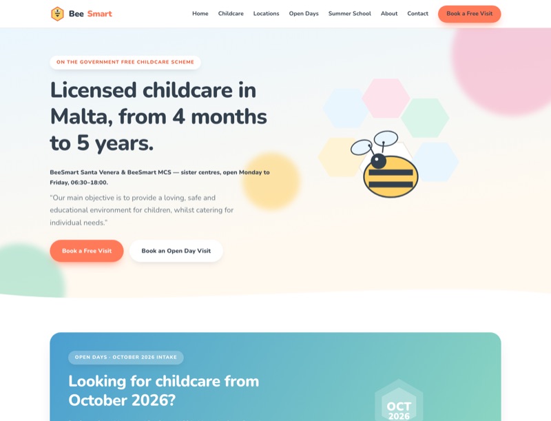
Design 1 Warm & playful

Warm pastel and playful — the closest to what Maltese parents already recognise.

Open Design 1
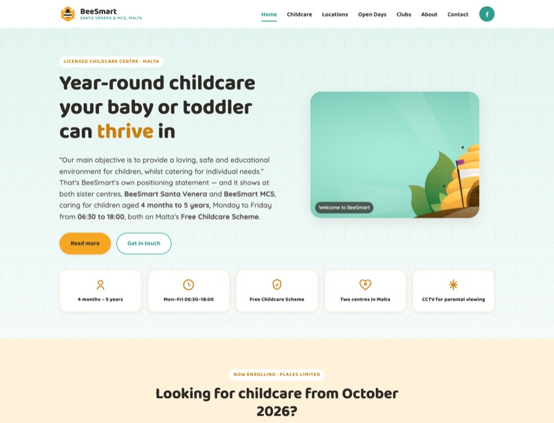
Design 2 Simple & friendly

Simple, photo-led and friendly — the easiest of the four to keep updated.

Open Design 2
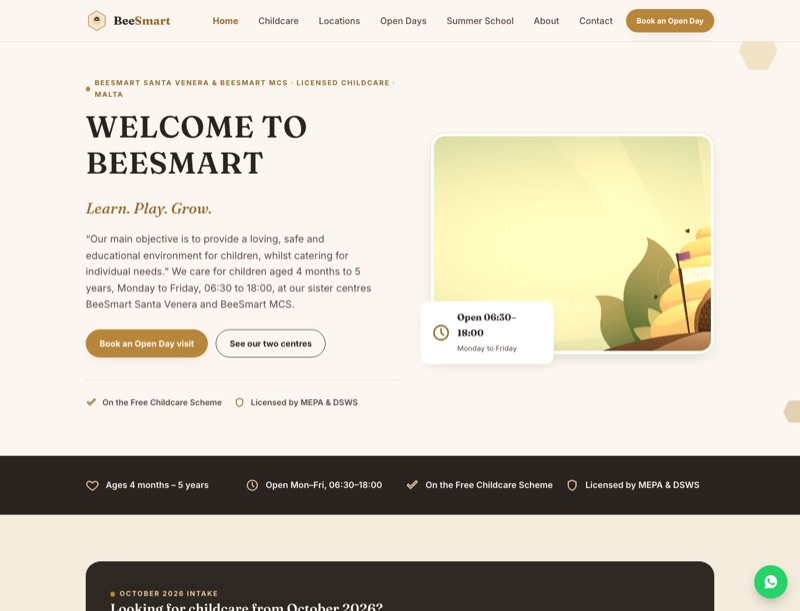
Design 3 Premium & grown-up

Restrained cream and gold — the most premium and grown-up of the set.

Open Design 3

The same foundations, whichever you pick

What every option includes

  • Eleven full pages, with an identical structure so you can compare like for like.
  • Both centres — Santa Venera and MCS in Birkirkara — each with its own page.
  • A dedicated Free Childcare Scheme page explaining eligibility.
  • Open Days set up as the main enquiry path for new parents.
  • The Summer Club and Holiday Club presented as seasonal programmes.
  • Mobile-first layouts that work on the phones parents actually use.
  • Accessible build — semantic structure, keyboard support and readable contrast.
  • Search-engine groundwork built in, so Google can find and describe you.

Being upfront

Two things are deliberately unfinished

Every photo is a placeholder

The images across all four sites stand in for your own photography. Nothing you see is a final picture — the layouts are waiting for real photos of your rooms, staff and children.

The enquiry forms aren’t wired up yet

The Open Day and contact forms are fully designed but not yet connected to a mail handler, so they don’t send email at this stage. Connecting them is a short final step.

This is on purpose. Leaving photos and forms until last lets you judge each design with your own content and destination in mind, rather than committing to placeholders. It is process, not omission.

The most useful section

What we need from you

Everything on the demo sites so far came from your public materials. These are the gaps only BeeSmart can fill — send us these and the site becomes fully yours.

  1. Your photo libraryPhotos of the rooms, staff, activities and both centres to replace every placeholder.
  2. Year-round enrolment stepsHow a parent actually enrols for a year-round childcare place, start to finish.
  3. A childcare fee scheduleFees broken down by age group or room, so parents see real numbers.
  4. Whether a deposit appliesIf year-round places require a deposit, and how much.
  5. Any waiting-list policyHow waiting lists work when a room or age group is full.
  6. Documents parents must provideThe paperwork required at sign-up, so we can list it clearly.
  7. Open Day dates & bookingsUpcoming Open Day dates and how you want bookings handled.
  8. Free Childcare Scheme sign-upHow scheme sign-up is handled in practice, step by step.
  9. Where enquiry emails goThe inbox that Open Day and contact enquiries should be delivered to.

Not everything has to arrive at once — even a rough version of the fees and enrolment steps lets us replace the placeholders with your real process straight away.

Next step

Take a look, then tell us which direction feels like BeeSmart

Start with the recommended design, browse the other three if you’d like to compare, and let us know your favourite. From there we’ll gather the details above and take your new site live.
One clear next step Open Design 4, then reply with the direction you prefer.
Open the recommended site